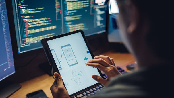
A modern website should look and feel seamless no matter where itʼs viewed—from a widescreen desktop to the smallest mobile device. Media queries and layout techniques are the tools that make this flexibility possible, ensuring that design adapts beautifully to every screen size.
Why They Are Important
Create a consistent user experience across devices.
Allow designs to stay visually appealing while remaining functional.
Improve accessibility and usability with adaptive layouts.
Increase engagement by matching the userʼs device environment.
Power of Media Queries
Media queries act like “if-then” rules in design. They adapt elements such as font size, images, and navigation, based on screen width, orientation, or resolution. This technique eliminates the need for multiple websites and ensures that one site works everywhere.
Modern Layout Techniques
Flexible Grids: Create adjustable columns that expand or shrink seamlessly.
Fluid Typography: Scale font sizes with the viewport for readability without zooming.
Responsive Images: Deliver appropriately sized visuals to optimize speed and clarity.
CSS Flexbox & Grid: Perfect for arranging layouts dynamically with fewer limitations.
Designing for Users First
Media queries and responsive layouts go beyond aesthetics—they improve usability. Navigation menus that transform into mobile-friendly drawers, images that resize without distortion, and text that remains legible all contribute to a frictionless experience.
Looking Ahead
As devices evolve, layouts will become more intelligent and context-aware. The future points toward container queries, adaptive design systems, and AI-driven responsiveness that automatically optimize layouts on-the-fly.


